边框设置
设置组件边框样式。
说明:
开发前请熟悉鸿蒙开发指导文档:gitee.com/li-shizhen-skin/harmony-os/blob/master/README.md点击或者复制转到。
从API Version 7开始支持。后续版本如有新增内容,则采用上角标单独标记该内容的起始版本。从API Version 9开始,父节点的border显示在子节点内容之上。
属性
| 名称 | 参数类型 | 描述 | ||||
|---|---|---|---|---|---|---|
| border | { width?: [Length] | [EdgeWidths]9+, color?: [ResourceColor] | [EdgeColors]9+, radius?: [Length] | [BorderRadiuses]9+, style?: [BorderStyle] | [EdgeStyles]9+ } | 统一边框样式设置接口。 - width:设置边框宽度。 - color:设置边框颜色。 - radius:设置边框圆角半径。 - style:设置边框样式。 从API version 9开始,该接口支持在ArkTS卡片中使用。 说明: 边框宽度默认值为0,即不显示边框。 |
| borderStyle | [BorderStyle] | [EdgeStyles]9+ | 设置元素的边框样式。 默认值:BorderStyle.Solid 从API version 9开始,该接口支持在ArkTS卡片中使用。 | |||
| borderWidth | [Length] | [EdgeWidths]9+ | 设置元素的边框宽度,不支持百分比。 从API version 9开始,该接口支持在ArkTS卡片中使用。 | |||
| borderColor | [ResourceColor] | [EdgeColors]9+ | 设置元素的边框颜色。 默认值:Color.Black 从API version 9开始,该接口支持在ArkTS卡片中使用。 | |||
| borderRadius | [Length] | [BorderRadiuses]9+ | 设置元素的边框圆角半径,不支持百分比。 从API version 9开始,该接口支持在ArkTS卡片中使用。 |
EdgeWidths9+对象说明
引入该对象时,至少传入一个参数。
| 名称 | 参数类型 | 必填 | 描述 |
|---|---|---|---|
| left | [Length] | 否 | 左侧边框宽度。 |
| right | [Length] | 否 | 右侧边框宽度。 |
| top | [Length] | 否 | 上侧边框宽度。 |
| bottom | [Length] | 否 | 下侧边框宽度。 |
EdgeColors9+对象说明
引入该对象时,至少传入一个参数。
| 名称 | 参数类型 | 必填 | 描述 |
|---|---|---|---|
| left | [ResourceColor] | 否 | 左侧边框颜色。 |
| right | [ResourceColor] | 否 | 右侧边框颜色。 |
| top | [ResourceColor] | 否 | 上侧边框颜色。 |
| bottom | [ResourceColor] | 否 | 下侧边框颜色。 |
BorderRadiuses9+对象说明
引用该对象时,至少传入一个参数。
| 名称 | 参数类型 | 必填 | 描述 |
|---|---|---|---|
| topLeft | [Length] | 否 | 左上角圆角半径。 |
| topRight | [Length] | 否 | 右上角圆角半径。 |
| bottomLeft | [Length] | 否 | 左下角圆角半径。 |
| bottomRight | [Length] | 否 | 右下角圆角半径。 |
EdgeStyles9+对象说明
引入该对象时,至少传入一个参数。
| 名称 | 参数类型 | 必填 | 描述 |
|---|---|---|---|
| left | [BorderStyle] | 否 | 左侧边框样式。 |
| right | [BorderStyle] | 否 | 右侧边框样式。 |
| top | [BorderStyle] | 否 | 上侧边框样式。 |
| bottom | [BorderStyle] | 否 | 下侧边框样式。 HarmonyOS与OpenHarmony鸿蒙文档籽料:mau123789是v直接拿
|
示例
// xxx.ets
@Entry
@Component
struct BorderExample {
build() {
Column() {
Flex({ justifyContent: FlexAlign.SpaceAround, alignItems: ItemAlign.Center }) {
// 线段
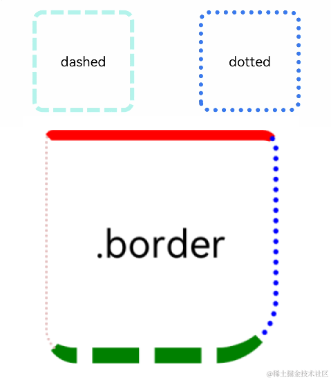
Text('dashed')
.borderStyle(BorderStyle.Dashed).borderWidth(5).borderColor(0xAFEEEE).borderRadius(10)
.width(120).height(120).textAlign(TextAlign.Center).fontSize(16)
// 点线
Text('dotted')
.border({ width: 5, color: 0x317AF7, radius: 10, style: BorderStyle.Dotted })
.width(120).height(120).textAlign(TextAlign.Center).fontSize(16)
}.width('100%').height(150)
Text('.border')
.fontSize(50)
.width(300)
.height(300)
.border({
width: { left: 3, right: 6, top: 10, bottom: 15 },
color: { left: '#e3bbbb', right: Color.Blue, top: Color.Red, bottom: Color.Green },
radius: { topLeft: 10, topRight: 20, bottomLeft: 40, bottomRight: 80 },
style: {
left: BorderStyle.Dotted,
right: BorderStyle.Dotted,
top: BorderStyle.Solid,
bottom: BorderStyle.Dashed
}
}).textAlign(TextAlign.Center)
}
}
}
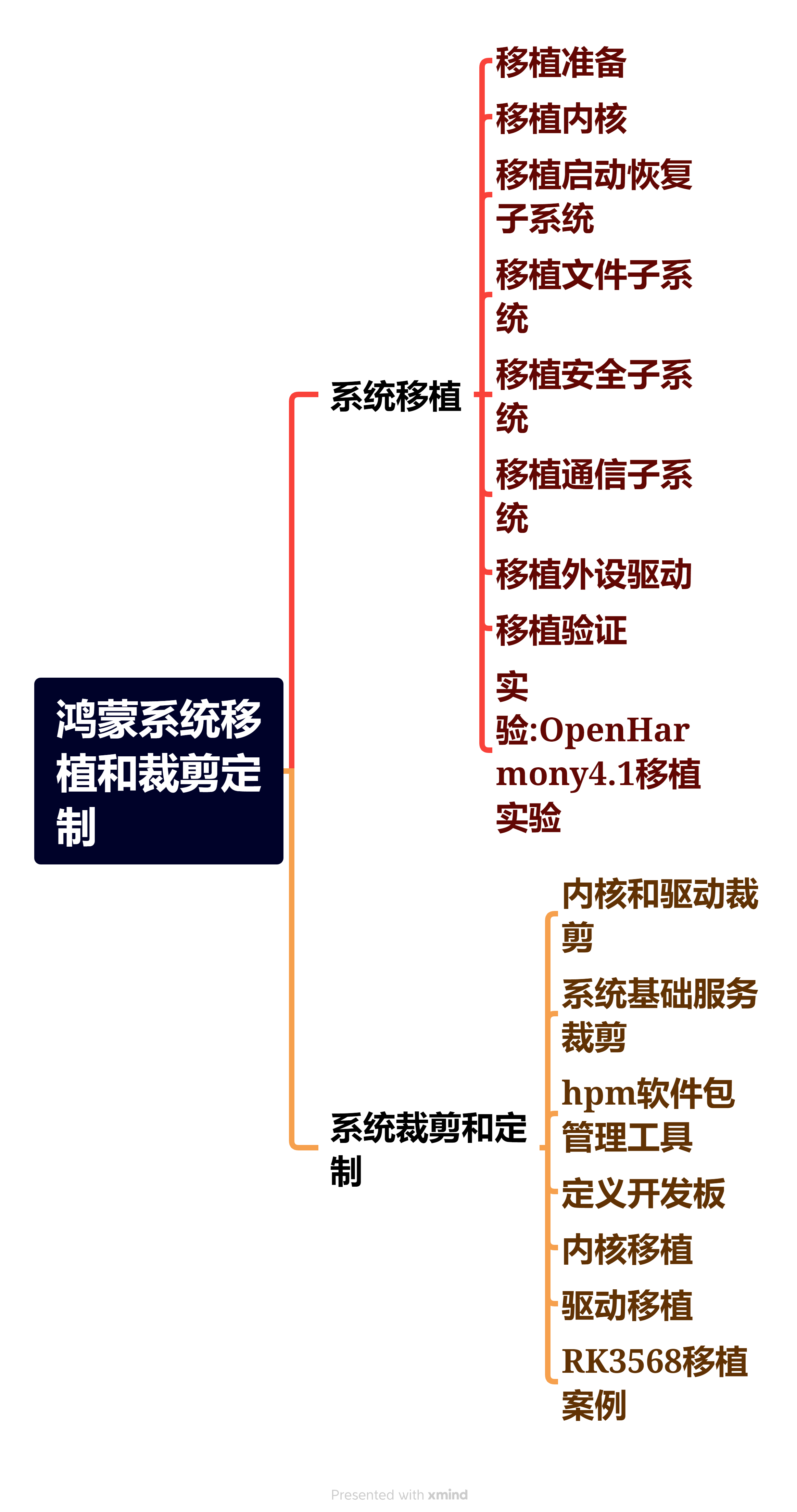
鸿蒙Next核心技术分享
1、鸿蒙基础知识←《鸿蒙NEXT星河版开发学习文档》

2、鸿蒙ArkUI←《鸿蒙NEXT星河版开发学习文档》

3、鸿蒙进阶技术←《鸿蒙NEXT星河版开发学习文档》

4、鸿蒙就业高级技能←《鸿蒙NEXT星河版开发学习文档》

5、鸿蒙多媒体技术←《鸿蒙NEXT星河版开发学习文档》

6、鸿蒙南向驱动开发←《鸿蒙NEXT星河版开发学习文档》

7、鸿蒙南向内核设备开发←《鸿蒙NEXT星河版开发学习文档》

8、鸿蒙系统裁剪与移植←《鸿蒙NEXT星河版开发学习文档》